Here in southwest germany the new year began pleasantly warm.
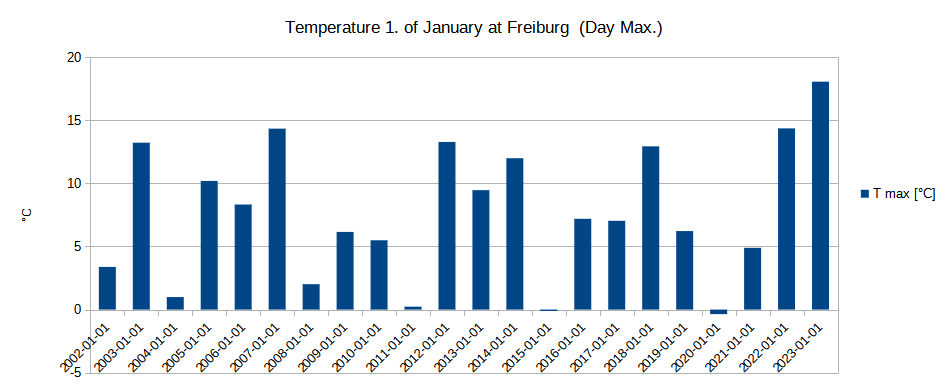
1. January was the first time this year it was warm enough to have breakfast outside.
Surprising as this may have been, let’s take a look at the recorded temperature data from an agrometeorological weather station from 20 years:
Just for the fun of it, here the Christmas temperatures:
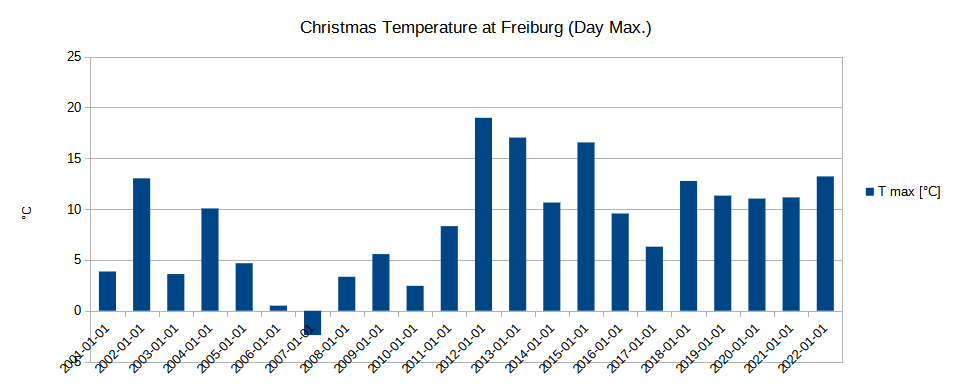
So what can we see here?
Two things:
- White Christmas is a fairy tale down here. There have been warm days before, like Christmas 2012, when we had 18°C.
- More than 10°C is not uncommon in winter.
Does this mean we do not see much of climate change?
Let’s have a different look at the same weather station:

Now lets look at the mean of all data from 20 years:

Now let’s switch to another data source, still at Freiburg, but here we see data since 1979:
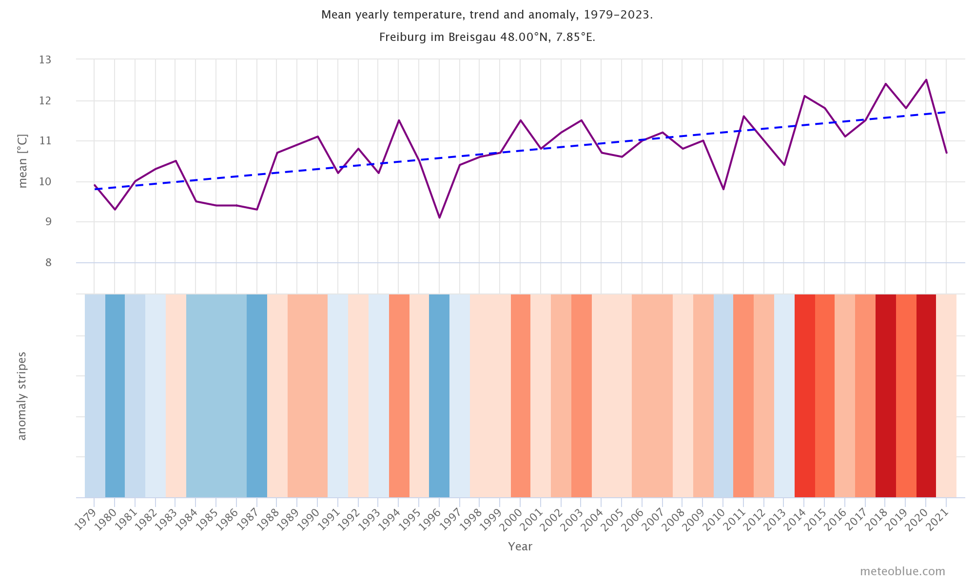
If this is not clear enough, look at the data from Baden-Württemberg, the south-west part of Germany:
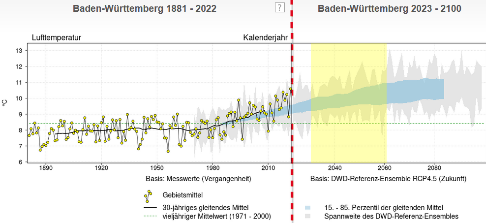
The yellow dots are the years mean temperatures, the back line is the 30-year average. The vertical red dashed line marks now, the right part is climate projection.
The climate model is run from 1971 onwards. Thus we can compare if the model from the perspective of 1971 predicts the time until 2022 correctly. What we see is that the model slightly underestimates the heating.
So here we go.
Remember this if you look at data: as in real life not every perspective shows the full scenery.
If you look for a nice site that visualizes climate data for you region, have a look at showyourstripes.info. Here their visualization for Baden-Wuerttemberg:
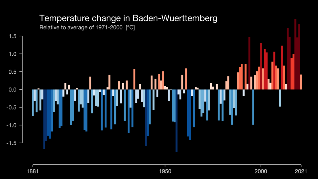
They visualize data for most of the world, data from the Berkeley Earth, NOAA, UK Met Office, MeteoSwiss, DWD, SMHI, UoR, Meteo France & ZAMG.
Check it out.